Evolving the Benetas online digital experience
the client
Meet Benetas
As one of the leading non-profit providers of aged care in Victoria, Benetas provides older Australians with services such as Residential Aged Care, Home Care, Respite Care, Retirement living and Allied Health. Through their work, over 4,500 older Victorians are able to continue to live positive and fulfilling lives with access to outstanding individualised care when needed.
Industry background
Adapting to a new landscape
In early 2017 Australian Government reforms around Aged Care changed the playing field for its providers. All of a sudden Aged Care started to get competitive.
Brands in the category were no longer simply allocated new customers by the government, instead, people were allocated funds and left free to choose their preferred provider.
Benetas saw this as an opportunity to not only embrace the changes brought about by reform but to use them as a catalyst to overhaul their entire model of care. Putting people and their personal choices at the heart of each service that they offer.
Working together with Benetas, we had a two-part job. Firstly, we needed to reflect these new policy changes online. Secondly, we needed to tackle the challenge of communicating the complex nature of government funding packages and payment plans to people who might be feeling uncomfortable with the transition to aged care for themselves or their parents or siblings.
The challenge
Designing an informative and intuitive website
Our challenge was to make it easy. Both in use and understanding. The choice in Aged Care provider will never be an impulse decision. It’s a task that is sometimes linked to a tight budget, sometimes completed hurriedly and perhaps on the behalf of someone else.
Once we understood the challenges and mindset of our potential customers, we paid particular attention to:
- Information Architecture (IA)
- Language and Content
- Clever user tools
- An all accessible design system
- Usability Testing
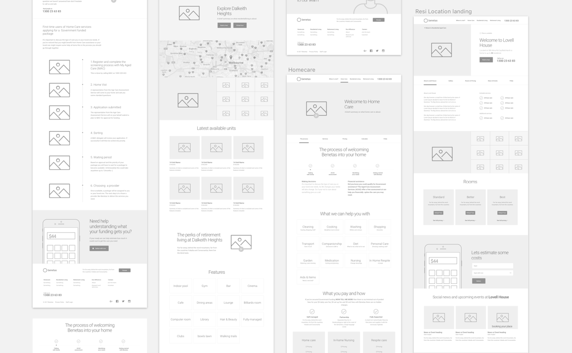
Content structure to improve navigation
Information architecture (IA)
Good Information Architecture can help people make informed decisions and find the content they need by providing the right information at the right time. Our goal was to structure our information to reduce the cognitive load of evaluating aged care options.
We did this by creating a flat navigation hierarchy with a limited set of options that were clear and not overwhelming. Additional information was then revealed as people journeyed deeper into the site.
Speaking to real people
Language and content
Whilst some services are heavily connected to the Australian Government, we don’t expect users to have the same knowledge as policymakers. We needed to speak to real people, in a helpful way. We did this by moving away from industry jargon and acronyms to conversational and real copy.
Tools to simplify complex decisions
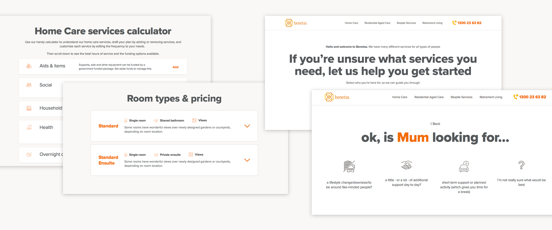
Calculators and questionnaires
We’ve always known that good service matters to people, but so too does money. With a variety of budgets and government support situations, figuring out what you need and what you can afford can be tricky, and sometimes, downright frightening.
So we made it easy, we took all of the complicated information and created clear and transparent calculators and questionnaires. These help people have a greater understanding of which services they need and what they can afford without overwhelming the process.
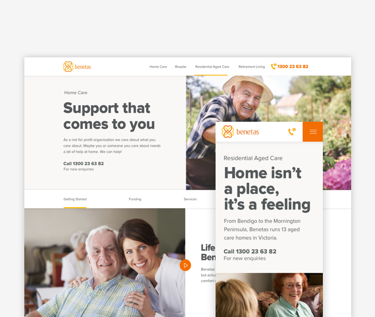
Accessibility
An AA accessible design system
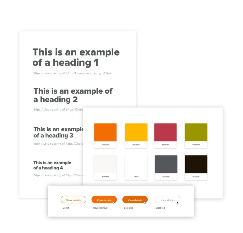
Ageing, like time, affects us all. This meant that we needed to design for people from all walks of life, driving our focus to create a design system with AA accessibility, whilst still being easy on the eyes.
Particular attention was paid to creating a design system that was flexible, scalable and had plenty of potential for reuse. We achieved this by working with an atomic design methodology. Atomic design defines small foundational elements like colour, typefaces, buttons and grid (atoms) to create an interface design system that is built upon in a deliberate and hierarchical way. These atoms are formed into reusable components (organisms) that make up page templates.
Evaluating our solution
Usability testing
Making something simple is easier said than done. To sense check our thinking we conducted multiple user testing sessions which allowed us to see first hand how people actually used the things we made. There is nothing more grounding to a creative team than to get prototypes and ideas in front of real people. To see people get confused, give up or get lost is the best way to refine your solution so it works the way people expect it to.
The final result
Here's what we achieved
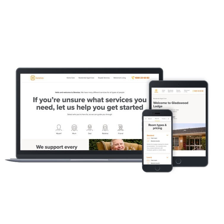
The final design solution is a website founded on a flexible design system, with tools that make the complicated simple, maps information in a way that makes sense and talks to real people.
This redesign has seen Benetas receive an influx of enquiries. People who might have had negative perceptions about the aged care industry are now reaching out to Benetas with new found confidence that they have found a brand that cares.