Insights & news from our side of the screen
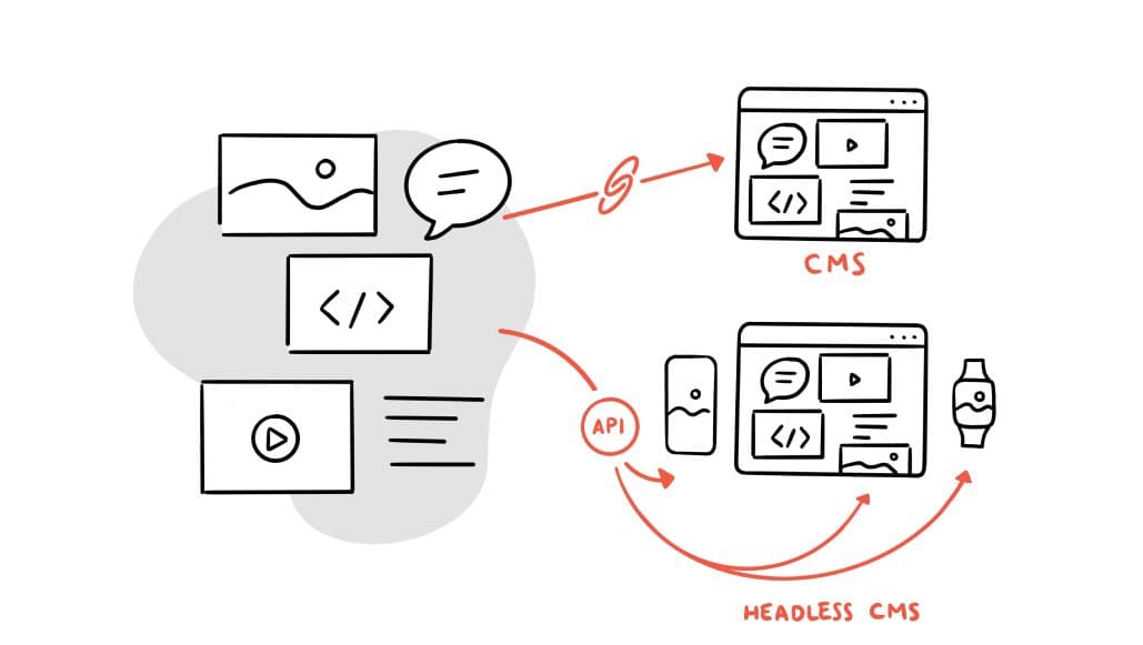
Enterprise SaaS is going headless. Here's what it means
In April, Salesforce announced Headless 360 at TrailblazerDX 2026, calling it the most ambitious architectural transformation in its 27-year history. We explore what is driving the shift and what it means for your architecture decisions.
Read article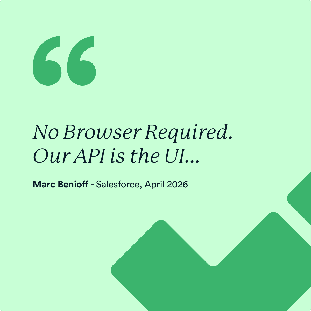
Join us for our free webinar, exploring the future of AI-driven customer service and what organisations can do to adapt.
Register here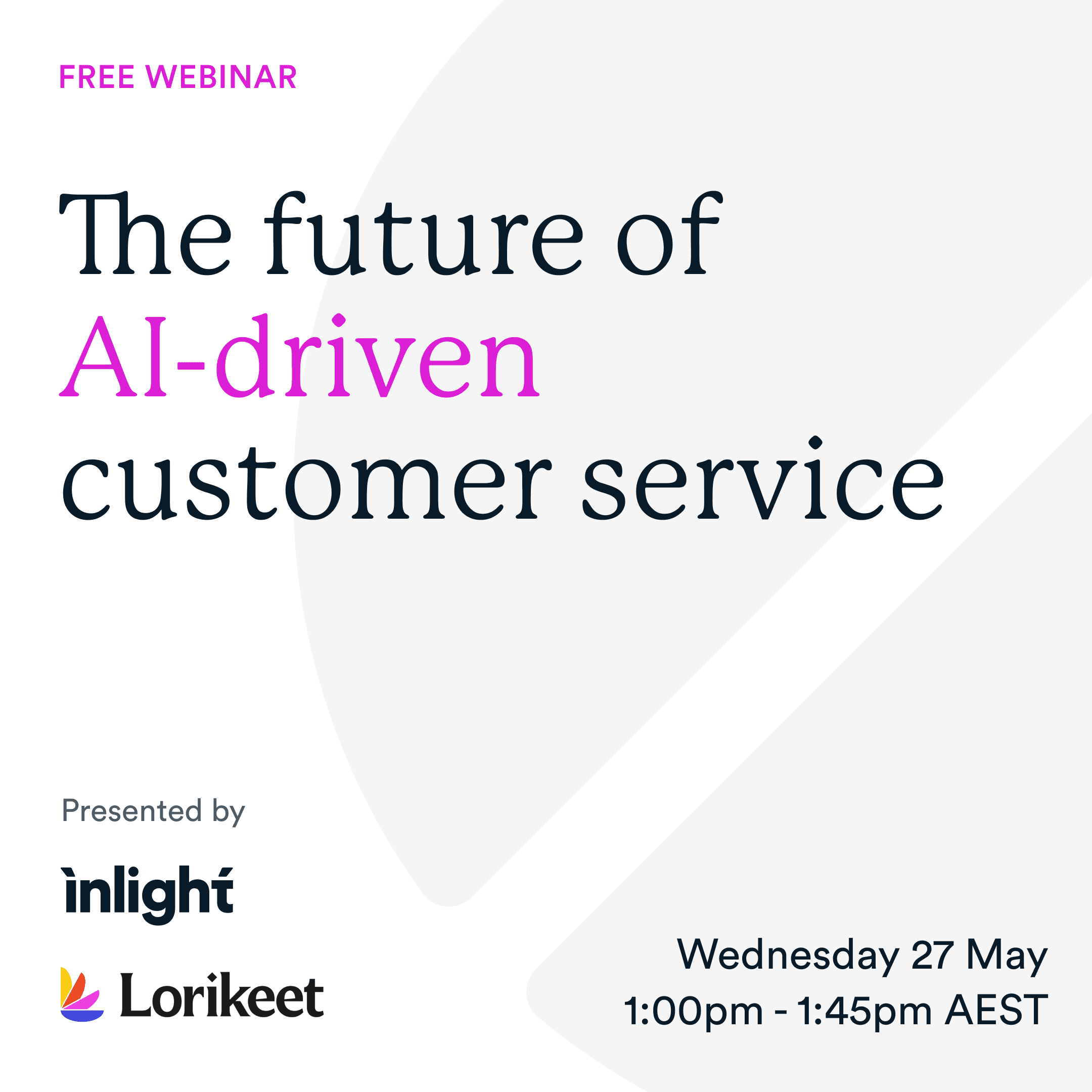

The economics of software are changing, and AI is rewriting the build vs buy equation
AI is changing the economics of software. Why digital leaders should rethink platform lock-in and own their digital foundations with best-of-breed tools.
Read article
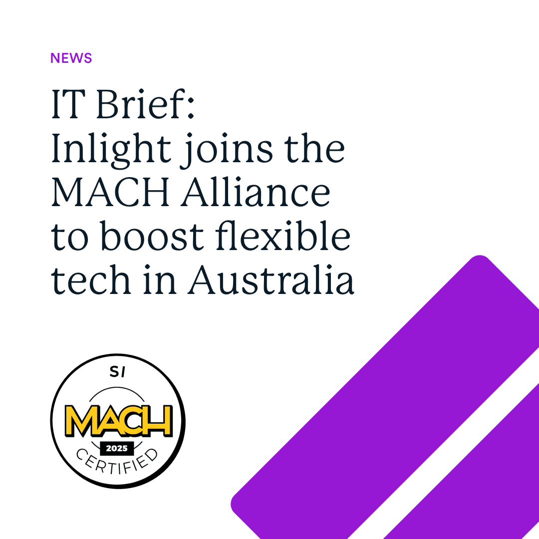
Inlight joins the MACH Alliance as Australia's first independent agency
Inlight has been accepted as Australia's first independent agency to join the MACH Alliance as a Boutique Systems Integrator member, a significant milestone that validates our long-held approach to building modern, composable digital platforms.
Read article
Is SEO dead? How to stay visible in AI search
AI is reshaping how people find, compare and interact with information, but that doesn’t mean SEO is dead, it’s evolving.
Read article
From clicks to conversations: Why AI is rewriting the rules of digital engagement
Read article
A Composable Future: Insights from Inlight's CEO
In the ever-changing digital landscape where agility and innovation stand paramount, I recently took the time to reflect on our journey at Inlight and explore a consistent theme that has emerged over the years to optimise for client success - composability.
Read article
It was a great night exploring AI, composability and the future of digital at our latest event, COMPOSE: AI Canvas.
Sign up to event announcements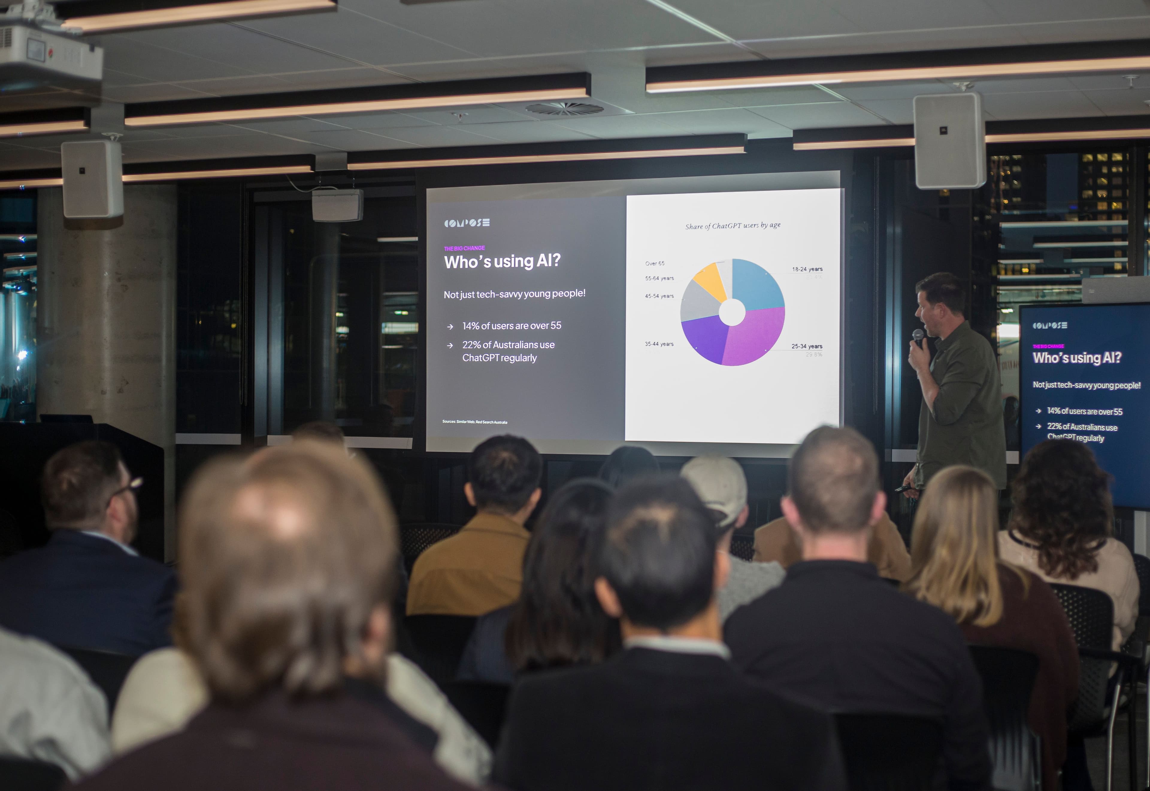
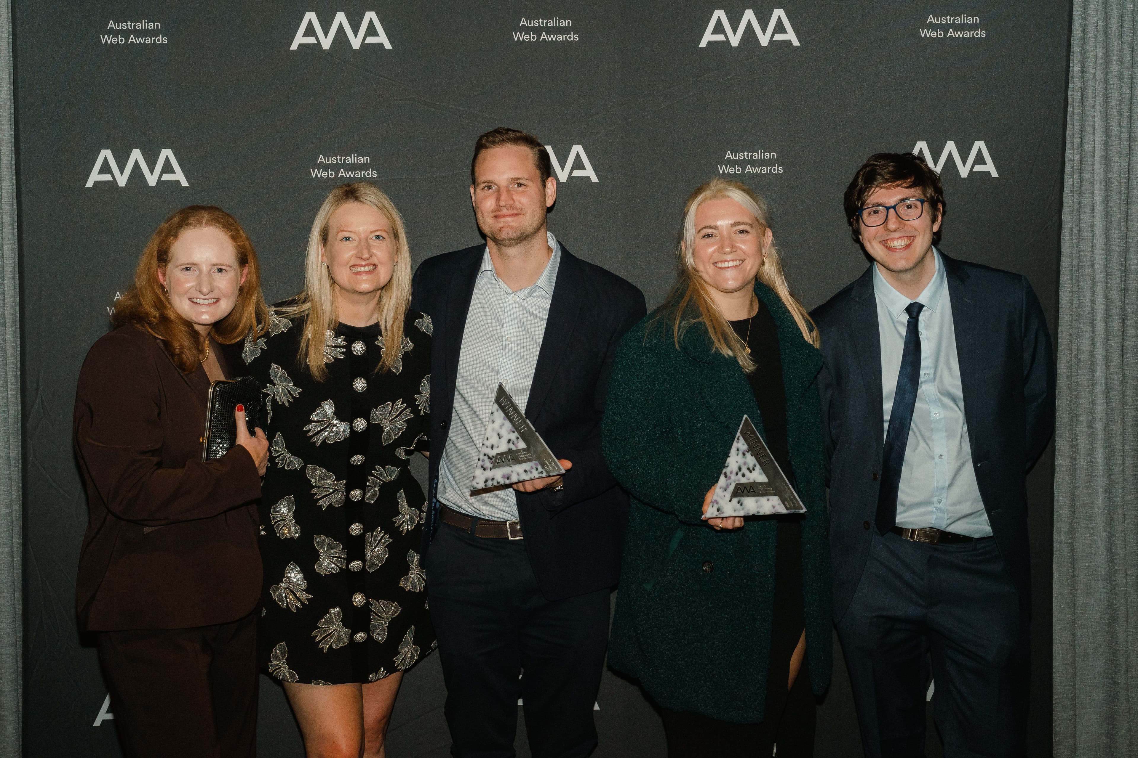
Our team, alongside Powershop, took home the Energy & Resources and Headless categories at the Australian Web Awards 2025!

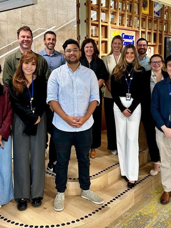
We’re partnering with Cancer Council Victoria

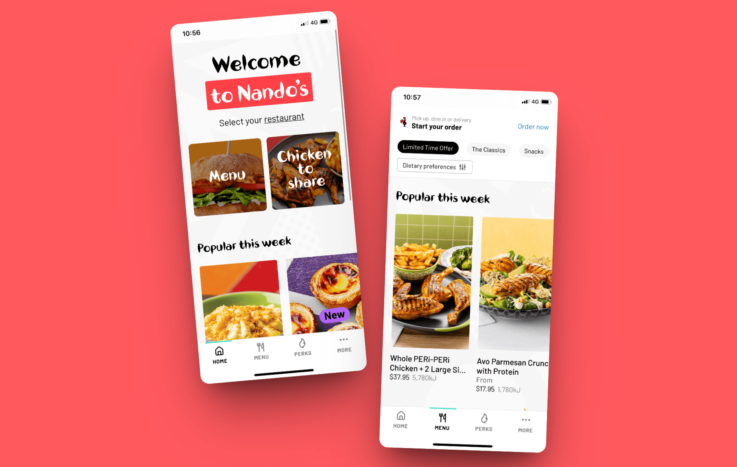
Why franchise owners must own their digital experience
Owning and customising your digital experience rather than relying on generic, vendor-controlled solutions is essential for Australian franchise growth, enabling higher conversion rates, better customer retention, unified data, and faster innovation in a rapidly evolving e-commerce market.
Read article